
Optimizing Paint Colors for Small Spaces: An In-depth Guide
Have you ever walked into a small room and felt instantly claustrophobic? The colors used in a space can significantly influence how large or small it feels, emotionally affecting the inhabitants in more ways than one. In this comprehensive guide, we’ll delve into the nuances of selecting the right paint colors for small areas, ensuring that these spaces feel airy and inviting despite their size constraints. The impact of color psychology cannot be overstated when it comes to transforming perceptions of space within compact settings.
The Psychology of Color in Small Spaces
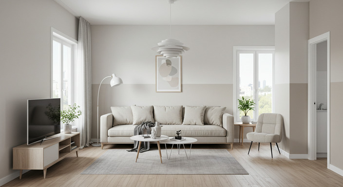
Exploring the psychology behind color is crucial in discerning which hues will work best in a confined area. Color impacts mood, perception, and overall room ambiance, thereby altering how small or large a space can feel. Bright, lighter colors like soft whites, light blues, and pale yellows have a reflective quality, enabling rooms to appear more open and expansive than their actual square footage. Conversely, darker tones like deep reds, navy blues, and rich browns absorb light, making spaces feel more enclosed and intimate.
However, understanding the psychology of color is not purely about selecting the lightest shade possible. It involves matching the mood that the space aims to fulfill, be it comfort, stimulation, or relaxation, with corresponding paint hues. A small, cozy reading nook might benefit from the warmth of a muted, dusky rose, while a compact studio might thrive under the expansiveness induced by a light, clear grey.
| Color | Effect on Space | Associated Mood |
|---|---|---|
| Soft White | Expansive | Tranquil |
| Light Blue | Open and Airy | Calm |
| Pale Yellow | Sunny | Cheerful |
| Deep Red | Enclosing | Passionate |
| Navy Blue | Intimate | Serene |
Harnessing Natural Light with Paint
Natural light is an invaluable resource for any homeowner, with its ability to enhance the appeal of any space, especially small ones. However, the selection of paint colors can augment or diminish this natural asset. Optimal use of natural light can be achieved through color choice, turning limitations into advantages.
South-facing rooms benefit from warm tones, balancing the coolness that northern light brings. In contrast, north-facing rooms with limited sunlight exposure can be enhanced using brighter colors with a pale base to reflect any available light. By allowing the natural light to mingle gently with the color of the walls, small spaces can emanate an inviting and spacious sensation.
Coordinating Color Schemes for Flow and Cohesion
“Design is not just what it looks like and feels like. Design is how it works.” Such words of wisdom from Steve Jobs apply beyond technology, delving into interior design. Consistency within a small space can minimize visual clutter and create a harmonious flow. Selecting a color palette that transitions gently from room to room offers a cohesive experience, wherein each area feels part of a greater whole rather than a disjointed compartment.
Implementing a monochromatic scheme can enhance this cohesion, relying on varying shades of the same color to introduce contrast without chaos. Alternatively, analogous color schemes, with shades adjacent to each other on the color wheel, subtly guide the eye while maintaining unity. Both techniques offer a spectrum of visual interest, ensuring each segment of a confined living area is engaging without being overwhelming.
Accent Walls: Adding Depth Without Clutter
A common misconception when decorating small spaces is the avoidance of accent walls due to a fear of overwhelming the area. However, when applied judaciously, accent walls can provide depth and character without crowding. Selecting a single wall as a focal point in a subdued, yet distinct, color can break up the monotony of a space dominated by light, neutral tones.
Accent walls are versatile, serving as canvases for artwork or architectural emphasis. For those hesitant to deviate drastically from the main wall color, opting for a tone one or two shades darker can achieve a modest yet effective transformation. This approach offers a balanced setting where visual interest harmonizes with spatial serenity.
Utilizing Patterns and Textures
Patterns and textures present an additional layer of complexity within color choice, influencing how a space is perceived. Compacted areas may benefit from subtle patterns – think delicate lines or small prints – that contribute to a sense of movement without overwhelming. Texture through paint finishes, such as matte versus gloss, can also impact light interaction, offering opportunities to play with depth perception.
While it may be tempting to incorporate elaborate designs in compact dimensions, restraint is vital. Overabundance can visually constrict, thus it’s essential to balance pattern and texture within the limitations of the space, ensuring that they enhance rather than dominate the area.
The Role of Trim and Moldings in Small Spaces
In their overlooked simplicity, trims and moldings serve as powerful tools in defining a room’s character and dimensions. Painting trims and ceiling moldings a shade lighter than the walls can create an illusion of height, thus opening up the space. Alternatively, maintaining uniformity between the color of the walls and moldings blends boundaries and expands perceived space.
Attention to detail in using contrasting tones, albeit subtle, provides a distinguishing architecture line that visually separates different sections of the room, enhancing its spaciousness and highlighting its unique structural features.
Implementing Color with Furniture and Décor
Beyond the walls, selecting furniture and decorative elements in harmonious or contrasting colors can complement the intended design illusion of space. Decorative mirrors, for instance, can reflect both light and color, doubling the visual area and brightness. Low-slung furniture painted in neutral tones contributes to an open feeling by limiting visual obstruction.
Neutral tones in furniture provide a backdrop to enliven a room through strategically placed colorful accessories. This approach allows for seasonal changes or trends without committing to a permanent overhaul, balancing stability and vibrancy.
FAQs – Common Inquiries
What are the best paint colors for small north-facing rooms?
North-facing rooms benefit from warm colors and lighter shades to maximize light reflection. Pale yellows, soft whites, and light, warm grays are recommended.
How can accent walls affect the perception of space?
Accent walls can add depth and character to small spaces. When using a darker or differentiating color, they create a focal point that can make a room feel larger or more connected.
Are contrasting colors suitable for small spaces?
Yes, but they should be used judiciously. Contrasting colors can highlight architectural features and create interest, but excessive contrast can make spaces feel cramped.
Can dark colors be used in small spaces?
Dark colors can be used sparingly as accents or on one wall to add drama and depth without overwhelming the space.
What finishes are best for small rooms?
Matte finishes minimize glare and are great for camouflaging surfaces, while glossier finishes reflect light and can make a small area feel brighter and larger.
Conclusion
Selecting paint colors for small spaces is a delicate dance between aesthetics and psychology, requiring careful consideration of light, mood, and personal style. The nuances of color impact the perception of space, offering tools to transform compact areas into vibrant, welcoming settings that defy their physical restrictions. Each choice, from palette to pattern, contributes to a harmonious environment, turning limitations into opportunities for creativity and expression.
Meta Descrição: Discover how paint colors can transform small spaces, enhance natural light, and create cohesive environments in this comprehensive design guide.